Study CSS——size, display & position
没想到一个月没有写新笔记了…这一个月以来我有何改变呢?这是个问题。
最近学习前端,深感对 html 以及 css 了解太少,进行网页布局时束手束脚,于是参照这篇 文章,把 CSS 的重要概念过一遍,形成一个整体的印象,以方便接下来的学习以及实践。
margin, padding, border
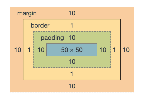
margin 为元素到其它元素的距离,border 为元素的边框,padding 为元素的内容到元素边框的距离;margin 在 border 之外,padding 在 border 之内。
margin,border,padding 有一些重要的规律需要记住:
- margin 永远是透明的,background 只在 padding 中可见
- margin 可以为负值,padding 不能
- 不同元素的 margin 会折叠(collapse,或者说重叠 overlap),padding 会堆叠(stack)
- 折叠是说 margin 会在 xy 轴上重叠(且实际的 margin 会是它们中的较大值;但 margin 为负数的情况下渲染情况并非如此),堆叠是说 padding(实际上元素本身)会在 z 轴上重叠,xy 轴上不会“挤开”(这种情况发生在 margin 为负数时)
- padding 可点击,margin 不可
- padding 和 border 计算在元素的大小中,margin 不计算
margin 可重叠这一点很重要,考虑下面两个元素,它们之间的实际的 margin 会是 10px 而非 15px。
1 | |
This is a title
Me a paragraph
顺带一提,指定 margin,padding 时,使用 2 个值时,分别代表上下,左右,使用 4 个值时,代表上,右,下,左(从上开始顺时针)
box-sizing, width, height
box-sizing 属性表示元素的大小,即 width 和 height 的语义,可选项有 border-box 和 content-box(默认值),其中使用 border-box 表示元素的大小为 border,padding,content 三者之和,即元素在边框内的大小,而 content-box 表示元素的大小为 content 的大小。
推荐使用 border-box,因为这对布局是更为方便且符合直觉的——我指定 width 是 100px,它就是 100px,我不希望它加上 padding 和 border 后值变得不是这个。当前我使用的 UI 框架 semanticUI 在所有元素均使用 border-box,猜测其它 UI 框架也是如此。
display
display 即元素的显示类型,最常用的 display 包括 block, inline, inline-block, flex 和 none。
example tags:
- Inline: span, strong, em, img
- Inline-block: button, select, (Chrome only: textarea, input)
- Block: div, p, nav, section
inline
inline 类型顾名思义,这种类型的元素不会创造新的行,且其竖直方向的 margin 和 padding 会被忽略,比如下面的例子。
1 | |
We often use type variables with type constructors to describe abstract features of a computation. For example, the polymorphic type Maybe a is the type of all computations that may return a value or Nothing. In this way, we can talk about the properties of the container apart from any details of what the container might hold.
inline-block
inline-block 类型和 inline 一样在行内(因此相邻的 inline-block 元素仍旧在同一行,不会另起一行),且竖直方向的 margin 和 padding 仍起效。
1 | |
We often use type variables with type constructors to describe abstract features of a computation. For example, the polymorphic type Maybe a is the type of all computations that may return a value or Nothing. In this way, we can talk about the properties of the container apart from any details of what the container might hold.
block
block 即块元素,block 元素会起新行,且默认占据其容器的整个宽度。
这里有个问题,如何让 block 元素水平堆叠而非另起一行呢?可以使用 float,但需要注意 float 元素不参与父元素的大小计算,因此这里的父 div 的 height 为 0,这会引起文档流的混乱,需要在最后去清空这个浮动效果,这里显示写了一个空元素,但也可以使用 after 伪元素。
1 | |
none
顾名思义,不显示,常用于显示/隐藏元素。
positioning
positioning 即定位,它关系着元素位置的计算方式,相关属性为 position,可选值包括 static(默认值),fixed,absolute,relative。
top, left, right, bottom 和 z-index 的属性也和元素位置相关,这些属性在 static 下不起作用。
static
在元素的 position 属性为默认值即 static 的情况下,元素的定位遵循着称为 normal (document) flow 的规律:
- block 元素占据其容器的全部宽度,以及内容的高度
- block 元素互相竖直地堆叠
- inline(和 inline-block)元素的内容大小即为其本身的大小
- 所有元素的位置都会互相影响(也就是说都在同一个平面上),margin 会折叠
static 的元素可以称它是没有定位的。
fixed
fixed 元素容易理解——固定在 viewport 的特定位置,用途包括置顶的导航栏,固定在特定位置的“回到开头”按钮,弹出框等。fixed 元素就像被从正常的文档流中移出,其它元素计算位置时对它不可知(哪怕是同为 fixed 元素)。
fixed 元素的默认位置仍旧是它在文档流中的位置(且 margin 属性仍旧生效),可以通过 top,left 等属性去指定位置。
这个默认位置问题似乎很多,考虑总是指定绝对位置
absolute, relative
absolute 则和 fixed 非常类似,唯一的区别在于,fixed 元素固定在 viewport 的特定位置,而 absolute 元素的位置相对于它祖宗节点中第一个非 static 的元素进行固定,若找不到这样的节点则相对于 DOM 的根节点。
absolute 的默认位置就会比较有意义一些,比如这里给这一行栓一条带子。
1 | |
而 relative,relative 元素的行为和 static 完全一致,唯一的区别在于它可以用作 absolute 元素的“锚点”。
absolute 的意义也可以猜想了,比如来个固定在一个弹出框右下角特定位置的按钮等。
summary
| Position | Behavior | In Document Flow |
|---|---|---|
| static | 默认,元素互相堆叠,互相可知 | Y |
| relative | 和 static 一致,但可供 absolute 作为锚点 | Y |
| fixed | 位置相对于 viewport | N |
| absolute | 位置相对于父节点中第一个非 static 的元素 | N |
flex
可以认为 flex 是一种一维的布局……?
真正现代的东西来啦!block,inline-block,inline 三种 display 都只应用在元素自身,而 flex 应用在其子元素中,使用 flex,能够轻易实现元素的水平堆叠。
1 | |
可以看到,这时候子元素水平堆叠,height 而非 width 为 100%。flex 能将元素按照一个方向去进行排列,相应配置项名为 flex-direction,值为 row 或 column,默认 row。flex 的方向称为主轴 main axis。
但 flex 最酷的地方在于,它解决了一系列编写 layout 的痛点,如水平/垂直对齐元素,分割、分组元素等,比如下面是一个常见的导航栏例子。
1 | |
flex 关于上下和水平的排序的属性,有如下:
| 属性名称 | 作用对象 | 描述 |
|---|---|---|
| align-items | container | 每一行行内在交叉轴上的对齐方式 |
| align-content | container | 每一行行间在交叉轴上的对齐方式 |
| align-self | item | item 的属性,覆盖行内交叉轴上的对齐方式 |
| justify-items | container | 定义子元素的 justify-self |
| justify-content | container | 每一行在主轴上的对齐方式 |
| justify-self | X | flex 下不可用 |
additional resources
不得不说,学完这篇文章,我对 html 着实是增加了一些信心,知道自己在做什么了,但这显然还远远不够。flex,以及 media query 后续再进行学习(这篇文章在这两个部分上的介绍应当也是比较精彩的),这里列一些下一步可能要去阅读的资料。
本博客所有文章除特别声明外,均采用 CC BY-NC-SA 4.0 协议 ,转载请注明出处!